1: A brief introduction to Powdermill Studio
My background is in London-based advertising agencies, brand consultancies and design studios and I have run my own creative and production studio as a web and graphic designer for over 20 years. For the last 8 years I have effectively been freelance, working from home, designing, building and optimising websites in HTML and WordPress, as well as continuing to work in print-based media.
My work has won awards, not only for creativity but also ‘real-world’ effectiveness. For example, The Institute of Sales Promotion’s Gold and Silver Awards for a campaign contributing to the most successful UK product launch ever by Electrolux; Creative Review’s Ad Test – third place from a field of over 1,500 agency entries; Corel Draw – international Top 10 beta-tester for illustration and design apps; Transport for London cycling campaign – recognition for their most successful ever poster campaign, judged on number of leaflets sent out in response to enquires.
In my approach to any design project, I thoroughly familiarise myself with the subject matter, so that I can present a faithful reflection of the client organisation and its aims and values. I don’t design for design’s sake – every element on the screen has a job to do – increasingly important today, with over 50% of all web browsing now carried out on mobile devices. There needs to be an efficiency in the use of screen space that will allow a site to work well on a 24 inch computer monitor, or a 5 inch mobile phone screen, while remaining legible and easy to navigate.
Apart from a website’s visual aspect, I pay particular attention to the structure and flow of content, ensuring that what can often be complex and detailed information is presented as clearly and simply as possible – and can be intuitively navigated.
When we met, you expressed some concern that Powdermill Studio is a one-man band. That is fair enough, but I would say that I have worked happily and well with many organisations over many years in this way. I think the concern would be greater should the TWPF website need frequent updating and changing. But looking at the nature of the Festival and the site, I feel very confident in my ability to provide a prompt and attentive service. I have informal associations with a couple of other web designers and we help each other as and when required. TWPF will remain entirely in control of the website hosting and, by using WordPress, the entire website infrastructure will remain license and copyright free. And, being the most popular Content Management System (CMS) in use today, there should be no problem in finding another web designer to take over the reins should we fall out for any reason.
The plus-side of being a one-man band is that you are assured to have my own input, thought, care and attention to detail at all times – your work won’t be farmed out to the studio junior.
References
Regarding work of a similar scope and nature which I carry out for other clients, I am very happy to provide references as follows (around seven years for each of the clients below) – just click on the company names to see their websites:
SUSSEX HERITAGE TRUST
Mrs Helen Reeve – Helen heads up the Trust’s publicity, marketing and events
helen.reeve@sussexheritagetrust.org.uk
INDEPENDENT SEARCH PARTNERSHIP
Mrs Vicky Griffiths – Vicky has liaised with me throughout the recent redesign of ISP’s website, the previous design having been in place since 2012.
vicky@independentsearch.co.uk
Design example 1:
TEPR
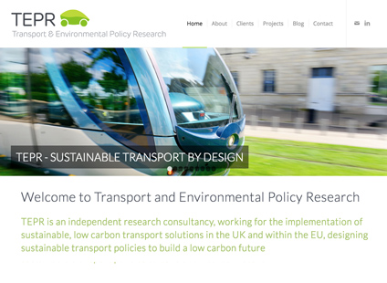
This involved a rebrand and website design for an environmental transport consultancy, Transport and Environmental Policy Research (TEPR).
While TEPR’s old website contained the necessary details and information which commissioning agencies would need to make a buying choice, it had been presented in long, text-heavy pages or buried in PDF documents. Navigation was inconsistent – and very fiddly on mobile devices.

I identified and addressed these problems in the new design seen here.
The old site and logo was a bit ‘fusty’ to say the least. The new logo reflects a clean, modern presentation of an electric car, further conveying the environmental aspect of their work in its leaf shape.
The website is likely to be the first point of contact for potential new clients. I visually broke up a lot of complex information and detail into bold headlines and short digestible paragraphs. People are impatient on websites and need to grasp TEPR’s outlook in seconds – and I think they will.
The navigation menu system is clear and precise – users are never more than a single click away from any page.
Images too have been carefully selected to appear genuine and honest representations of real-life situations, rather than contrived, cheesy cliches too often used on company websites.
And the site is fully mobile-friendly, passing Google’s mobile-friendly test with no advisories.

